How to Analyze Your Data with PAUSE
Once you’ve run your analysis in PAUSE, you may be wondering how to interpret the plots you receive. This short guide should assist you in just that.
Good Results
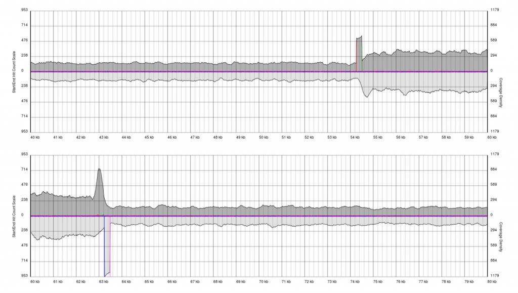
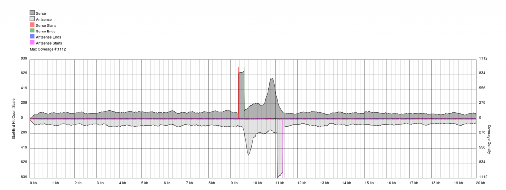
After running PAUSE Plotter on raw sequencing data, good quality data will produce output that looks like the following:
You will see a continuous region of single coverage and an area of double coverage (above) or increased coverage (below) bracketed by definitive 5′ and 3′ borders.
The red line represents a pile-up of sense starts of the raw sequencing data and the pink line represents a pile-up of antisense starts of the raw sequencing data. These lines correspond to the forward and reverse boundaries of the terminal repeat.
With quality data, once plots are generated the exact positions of the boundaries (to the base pair) can be obtained from the PAUSE Base output.
Bad Results
In some cases, you have low quality data, which is characterised by extremely noisy starts and ends.
Data sets will appear noisy and you will find no defined sense or antisense starts. In truth, the read start data is no more noisy than in good quality data, however due to the much lower sequencing depth, the spikes are significantly higher relatively to the sequence coverage plots (gray). In this case it is not possible to see pile-ups
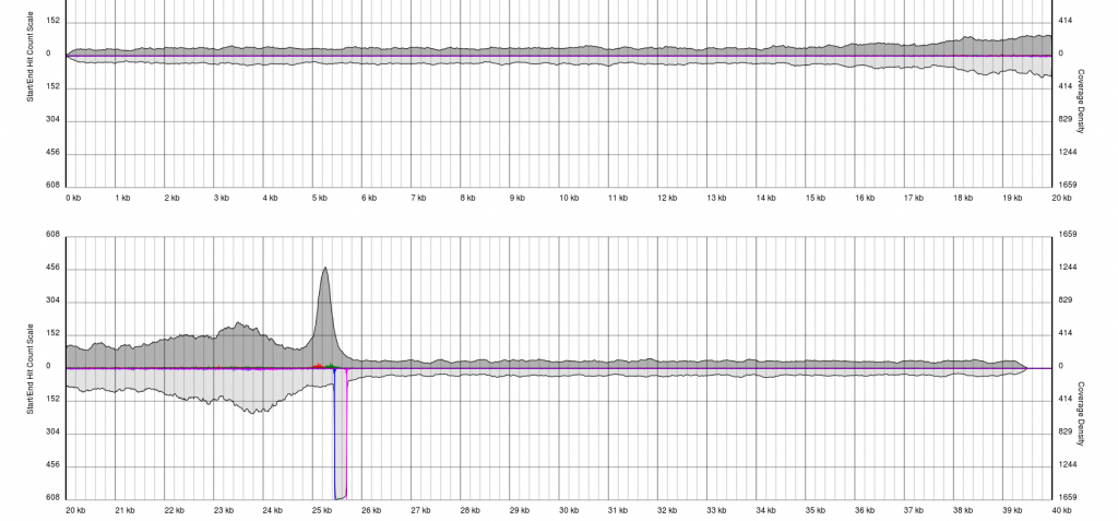
There are endless possible failure modes with no interpretation, take for example the following:
In other cases, you will see a gradual pile-up of starts or ends and will not be able to confidently predict either the sense/antisense start/end to the terminal repeat. In these cases, terminal redundancies cannot be predicted. Experimentation or re-sequencing will be needed to determine genomic ends or terminal redundancy boundaries, respectively.
Quick Guide
| Type | Description |
|---|---|
| Long TRs | Characterised by regions of double coverage >1.5kb |
| Short TRs | Characterised by regions of double coverage 0-1kb |
| Non-Cos/Headful packaging strategies | No defined appearance in PAUSE and require PCR for closure. |
Running PAUSE in Galaxy
Running PAUSE in Galaxy is very easy to do. We provide a couple of workflows for paired-end and non-paired-end data which should help you get started. Simply upload your SFF or FastQ data (we have an SFF->FastQ converter installed), and run the workflow with the appropriate inputs.
Interpreting your results
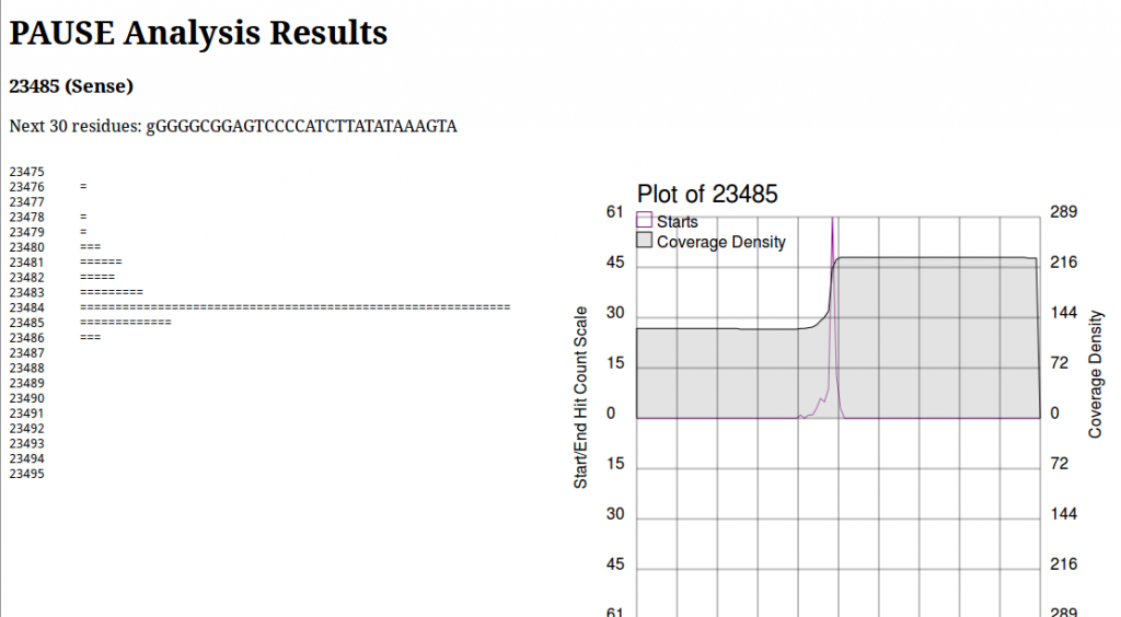
PAUSE:Base produces a page that looks like this:
On the left we see a log histogram of starts, and on the right we see a visualization of this. The plot on the right is mainly to provide context for your analysis, and help you make informed decisions about whether or not a location is a start that you’re interested in. This is important to note, due to an old unpatched bug as well as some shortcomings in the particular peak finding algorithm, the numbers above the chart and in the section heading are wrong. Always look at the historgram to positively identify the first base of a repeat region. Here we would see the histogram has a very sharp peak at 23484 and identify that as the first base of the repeat region.
PAUSE fails to find my peaks!
Sometimes, PAUSE will fail to identify peaks that are obviously (to you) peaks. In that case there are a couple of options:
- Lower the SNR (signal to noise) ratio threshold. It defaults to 15, but you can decrease this and obtain larger lists of peaks.
- Manually identification
Since the first option merely requires re-running the tool, we’ll cover the second option. In the CPT:PAUSE toolbox in Galaxy, there is a tool called PAUSE:Histogram. This tool will print out the number of starts at every single base in the entire genome. These very non-specific results can be used in conjunction with PAUSE:Plot. First use PAUSE:Plot to identify regions of interest where you expect the peak to be, then scroll to that location in PAUSE:Histogram to precisely identify the base of interest.


